Looking at a zebra penned in at a city zoo, it is hard to believe that these beautifully striking beasts are really the product of nature. Fellow captives in the land based animal kingdom sport hues of grey, green and brown fur and feather as camouflage, for both carnivores and the hunted, under Darwin's laws of natural selection, have evolved exterior coatings that draw on a more limited palate.
 |
"It doesn't it matter if you are black or white" |
Genetic mutations such as albinoism (alba=white), alarm colouration (black & yellow) to notify danger and poison like wasps and frogs and distinctive show colours to enable sexual reproduction are the exceptions that spring to mind.
White with black stripes or black with white stripes ?
"The zebra’s striped coat is simultaneously extraordinary and stunning" states the Guardian. link Godlike creations, according to some early naturalists. Current popular belief is that the zebra stripes evolved to offer a disguise on the African grassland savannah, hidden from hunting lions in the long grass at twilight, although Darwin himself was not convinced by this argument. link
 |
Chris Rock voices Marty |
In our Hollywood celebrity driven culture it is perhaps worth considering role model portrayals and we find that in the DreamWorks animation 'Madagascar' Marty the zebra (or zee-brah), voiced by comic Chris Rock link, has white stripes. So that decides it.
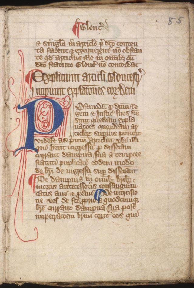
Let us leave paper letter technology in the 20th century
Ironic that in the 21st Century we attach word and pdf documents, cut in A4 sized pages, so they print nicely on foolscap paper (so called after a fools cap water mark was used as an early quality mark, a forerunner of contemporary brand hologram authenticity labels).
 |
"Today I am adding red flourishes" |
Three emails later, and importantly three days later, I have a word document that I'm meant to type into - although having written text in an email quickly and attempted to write in the distorted .rtf file, I have been very slow at my fourth iteration of this modest endeavour. I bet the cross check boxes are not clickable - such a simple thing.
So this begs the wider question - why do our processes continue to utilise slick, fast & cheap electronic methods to emulate the historic scratching of dye onto parchment ? I think I might ask uncle Tim at Apple for a papyrus designed gizmo this Christmas, I have already got a watch !
Black is the absence of light
Now for me and my limited science background (I do have to disclose physics, chemistry and maths 'A' levels good enough to get me into Warwick) black and white are not colours, but pure light and the absence thereof.
We do not see black, but notice the difference around it. Therefore I fail to understand why those clever people in Seattle at Microsoft and others in the silly-con valley (sic) keep writing code that emulates the process, pre-Caxton printing press, that medieval monks would have died for. (side bar: Thanks to Henry VIII many did !).
I may be biased, as my presentation DNA was developed at British Airways, where the corporate house style always used dark blue backgrounds and a golden yellow font. Is it not crazy that we have to sit in soporifically dark spaces to allow bright light to shine around stuff we aren't looking at ?
Look at the big screen, stupid !
Key feedback I often give to students preparing for presentations is to ensure that their slides work effectively on the big screen. Like zebra patterns, what you see up close may be hard to make out from a distance.
Using three or less font styles, maximum 16 words and leaning on the old cliche "a picture paints a thousand words" offers an engaging graphic story that compliments rather than replaces the human presentation.
How often have you skim read wordy slides in a thrice & then been rather bored as the speaker labours painstakingly through each and every point, when your enthusiasm to listen and engage has already dissipated. Better surely to titivate the audience and cover off any missing items by answering follow on questions ?
Justin
P.S. For the record, all my teaching presentations this year (well, nearly all of them) have a black background and use a white font.
P.P.S. What a quaint idea (post script) from the time when everyone spoke latin, as clearly I am unable to go and revise what I have just written ? - just like the expression of "inking in" a meeting into the diary !
The prize for tenacious bloodsucking readers
The answer to the curious question as to why to zebra have stripes ? Current (from 2014) science thinking suggests that stripes can help deter bloodsucking flies, read the full paper on Zebra stripes here: Caro T et al (2014) The function of zebra stripes. Nature Communications. Published 1 April 2014. doi:10.1038/ncomms4535